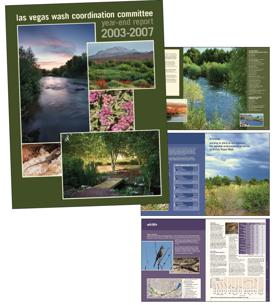
CASE STUDY: The Las Vegas Wash's (UN)brand
While not officially considered a rebranding, this internal client (an ecology branch of the Southern Nevada Water Authority) had previously been considered “difficult” and so was handed to me for special attention. Because I knew I would be responsible for a variety of projects, I created a brand style for the client and adapted it to whichever projects came my way. This included a dedicated color scheme, font choice, and even a slight modification of the logo to render it easier to use throughout multiple applications.
Overall, each component of a Wash's project comprises large photography, color-coordinated sections for organization, clean presentation of complex scientific findings. Document is designed and written to explain progress of the department’s goals to enable inform policy-makers and maintain funding.
AWARDS: Multiple iterations of the LVWCC's annual reports were awarded for excellence in communication design by the Public Relations Society of America, including the highest honor in its category, a Pinnacle.
This comprehensive five-year review showcases the efforts, progress, and achievements of the Wash Committee and received two distinctive design awards for from the Las Vegas chapter of the Public Relations Society. One judge in particular commented on the excellent organization and layout of such a massive amount of information. The document was also made available as an interactive PDF. Special considerations: recycled paper used on 4 color press required on-site supervision
This anniversary tour Invitation showcases six native plants thriving where the tour’s commemorative event and dedication would occur, while the poster honors both the beauty of the area and the work of those responsible for its upkeep.
I also designed and supervised production of 4 large-scale outdoor interpretive displays that explain pollution causes, water cycles, and local wildlife at the Las Vegas Wash.
CASE STUDY: ywca and the high profile brand
Up until 2016, YWCA's brand held steadily at PMS 172 and Arial Black. For any YWCA project, it’s been imperative for me to design within brand guidelines but also to provide creative solutions to what might have been tired, repetitive information delivery.
We hired Jennifer to design an invitation and accompanying program book for our black-tie fundraiser. Not only was her work well-received by those in attendance, but our sponsors were very pleased with the professionalism of the pieces. Jennifer was easy to work with and kept to established timelines - something that is oftentimes rare in this day and age! ---Kristi Brennan
YWCA requested a new, timeless, celebratory look to brand this annual event honoring the achievements of local women. Keeping with the national branded colors and typefaces, I added simple graphic streamers and created variety and movement by varying the weight and size of their simple font.
I created a template for the newsletter bending shades of PMS 172 to my will so the YWCA Mohawk Valley community, donors, and board members can be informed of upcoming events, human interest stories, and fundraising effort results, all in an easy-to-read and very familiar publication.
The annual report allows a tiny variation on corporate colors: a bright sunny yellow orange supports the existing brand and adds a burst of warmth. 2011’s theme was “Moving Forward,” based on artwork provided by domestic violence survivors.
This invitation supported an event for a foundation linked to the YWCA but not directly connected, allowing a brief departure from the standard PMS 172. The starburst symbol comes from the logo of the foundation's beneficiary organization.
This is an example of the new Salute Invitation, in contrast with the first image. This design follows the new branding (as of January 2016) and the introduction of Avenir Next as the Y's featured font.
I took my cues again from the new branding guidelines for The Annual Report for YWCA's 2014 fiscal year, and integrated a combination of photos provided by the Y and appropriate stock images.
case study: evolution of THE RÉSUMÉ STUDIO AND THE REDICK GROUP
Jennifer has designed for the big guys after all, and it shows. Jennifer had just the design expertise and professional insight I needed to translate my vision into reality. Thank you, Jennifer. You enhanced the conversation I’m having with my clients. And I’m busier than ever. --Jared Redick
My relationship with the Redick Group began as an experiment in code-writing. I spoke with Jared about creating a new website for him so that he could move away from the bland, templated look of his existing site and really begin presenting himself as an expert in the field.
Jared's most important brand aspect is his own personality. The home page of the design communicates simultaneously his expertise, (books in which his work has been featured) and services while offering up samples, and the general feeling of professionalism, trust, and warmth he wanted to communicate. The Golden Gate Bridge serves to identify his location and acts a symbol of transition from one phase of one’s career to another.
This site was coded "by hand" with HTML and CSS before CMS were readily available and smart phones and tablets had yet to overtake computers for web searches. To display pop-out versions of his resume samples, I borrowed open source code found online.
Before we could build an effective website, he needed a logo and an identity for his business. We started with a discussion of his love for the Evernote web app, which influenced the font choice: Caecelia. We kept to a text/tagline only design as any writing symbols seemed outdated.
Provided to the client in Word templates and PDFs as needed for printing in-house or professionally.
As his business grew and the use of devices for viewing websites became the norm rather than the exception, I redeveloped the site using the SquareSpace platform. I've customized a simple template by manipulating the CSS to echo the feel of the original site, bringing it up to current style trends with a hero image and white space.
Based on his success as a career-transition coach, Mr. Redick decided to create an umbrella brand for all of his endeavors.
Based on the brand we’ve already built for him, I designed a larger, more comprehensive website where he could link his social media efforts, product sales, blogging, and business services together. I designed the appearance and structure of the site and worked with a third consultant, a web developer specializing in the WordPress platform and SEO. As we transitioned to a larger audience and reach, we incorporated other famous bridges, but again echoed theresumestudio.com's modern style, with the hero image/three selections.
*still in development; site is live but invisible to search engines at the request of the client*
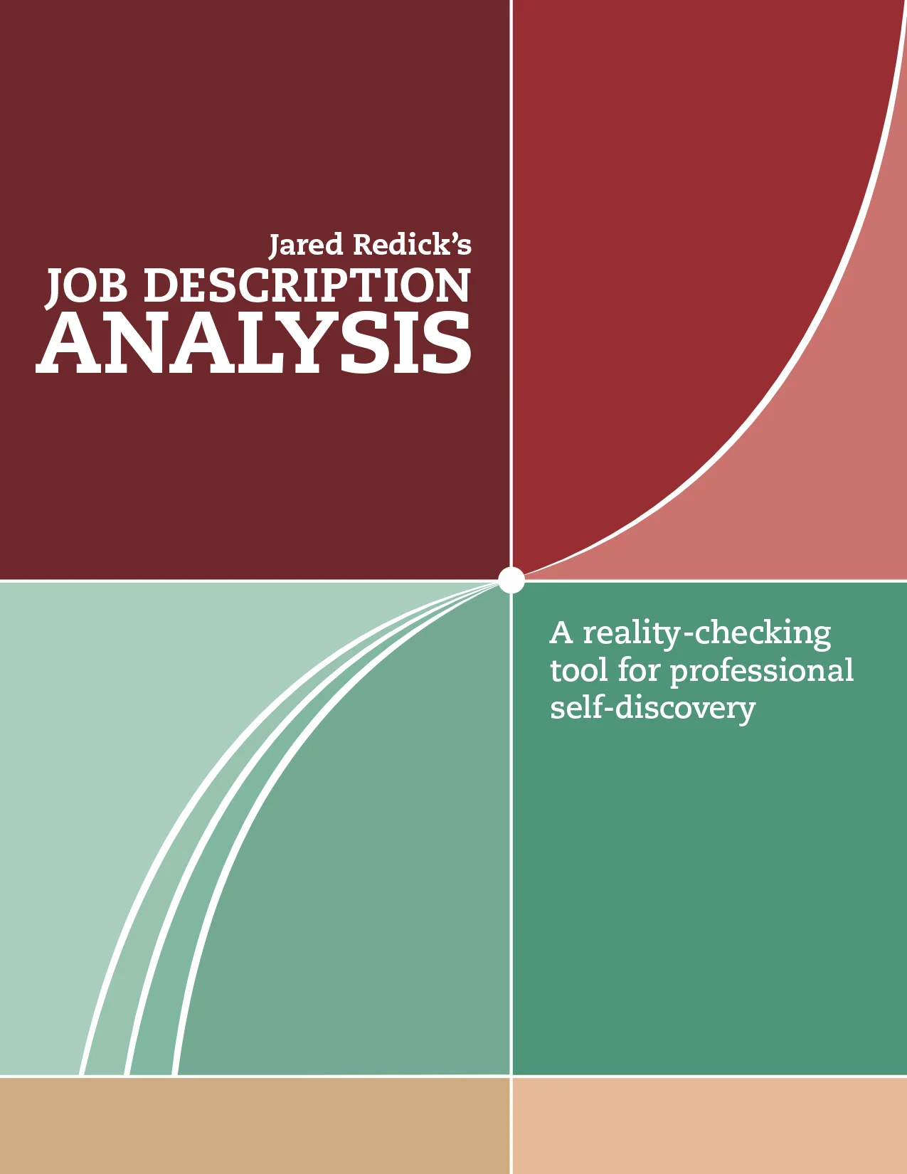
The workbook: more than a PDF
Jared's work is often regarded as an inflection point for many of his clients. In this workbook, I extended the font and color scheme from his brand but instead of a bridge to symbolize transition, I drew a literal depiction of an inflection point.
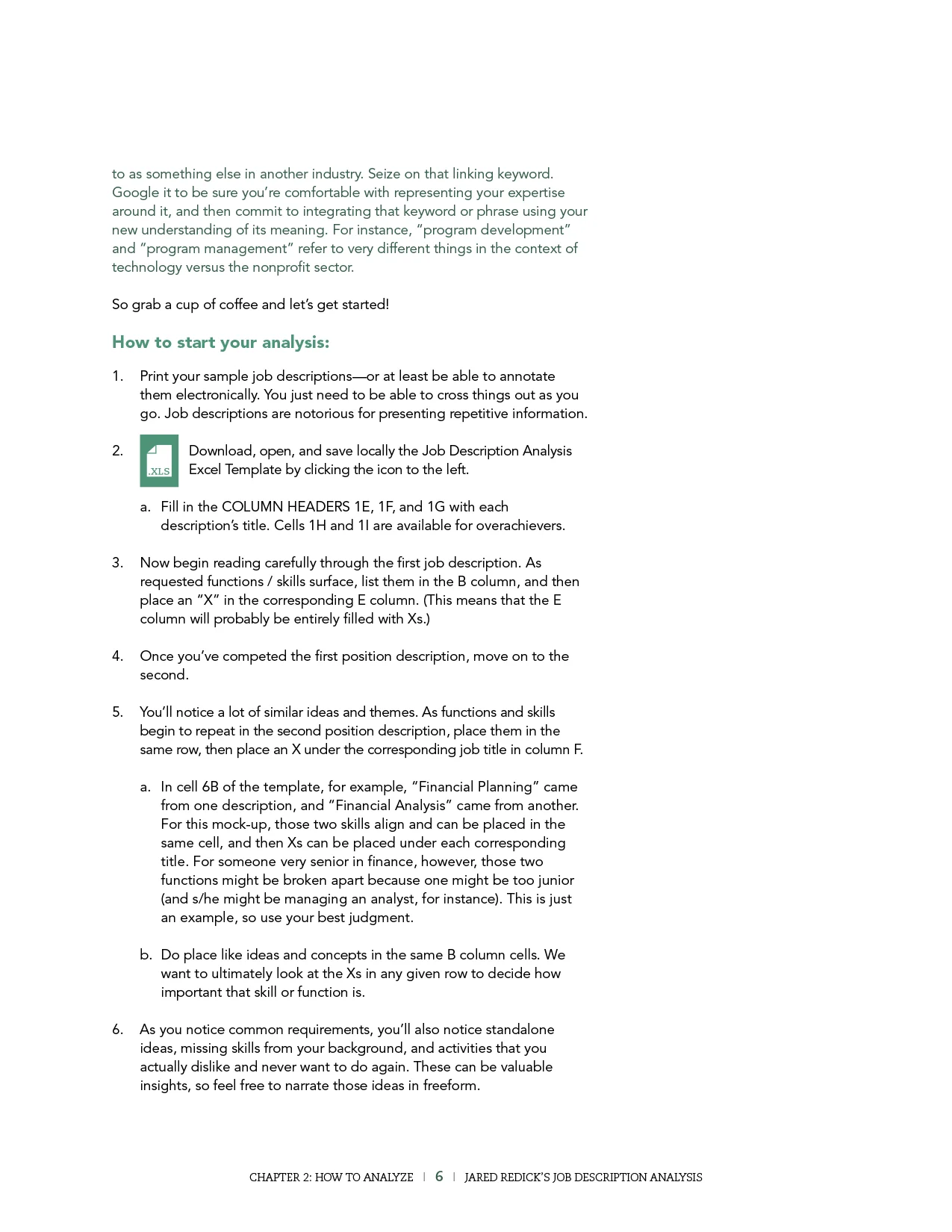
The workbook is a downloadable, fully interactive PDF with links to important websites, page transitions, and embedded Excel templates. I also provided copyediting as needed.
*product was developed for and recommended to graduate students throughout the University of California system*