editorial design
editorial design
FEATURES
All selections from
Plank Road Magazine


The editor for this issue curated a special section within this issue to highlight the generosity of individuals and organizations based in Central New York. To unify myriad subjects and add visual interest to what was otherwise a weak selection of photography, I obtained a unique new typeface (my search was for something sophisticated but also short and fat) and illustrated the titles with custom ornamentation.
published: Winter 2011


To illustrate this nostalgic road trip feature, I took a cue from retro travel postcards. I created my "postcard" from photos of the road and landmarks along Route 20. I continued the old-school vibe by framing the photos on the following pages with thick white borders.
published: Summer 2012


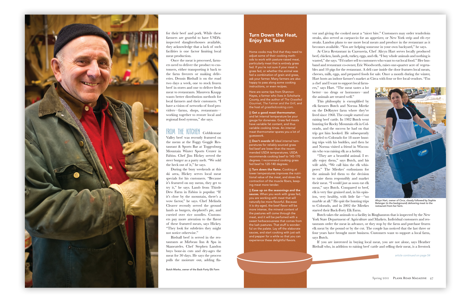
I often inject an unusual sense of humor into my work. In this case, I thought about testing the audience's sense of humor: where does our meat really come from after all? We had beautiful images of elk from a local farm and with the idea that our particular audience wouldn't want to see photos from the butcher block, I drew the steak, sausages, and drumsticks to go along with my animal silhouettes. Color cues were taken from the photo.
published: Summer 2011


This piece is an example of what happens when photography is so good that it should take center stage. My minimalist layout supports the detailed, warm, and illustrative images.
published: Summer 2014


published: Spring 2013


published: Spring 2014


published: Spring 2012
Mini-features
Each issue of Plank Road contained a feature too brief to be considered a feature, but too detailed to be considered a department. For these pieces, I used a consistent design style but varied the color combinations, depending on an often-limited photography selection.


DEPARTMENT PAGES
Our magazine referred to these department pages as "Short Planks." Consistency figured strongly in my design of these pages, and I assigned colors to the title bars to each genre of department. Cooking departments were mint green, personal interest departments were cornflower blue, and pieces written by readers or special editors were brick red.


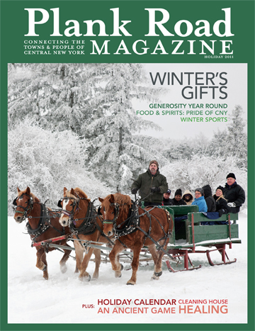
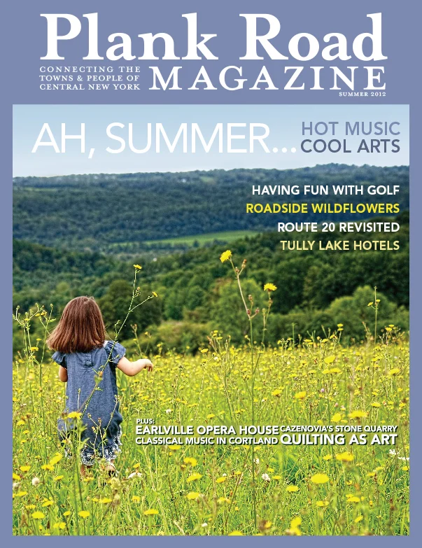
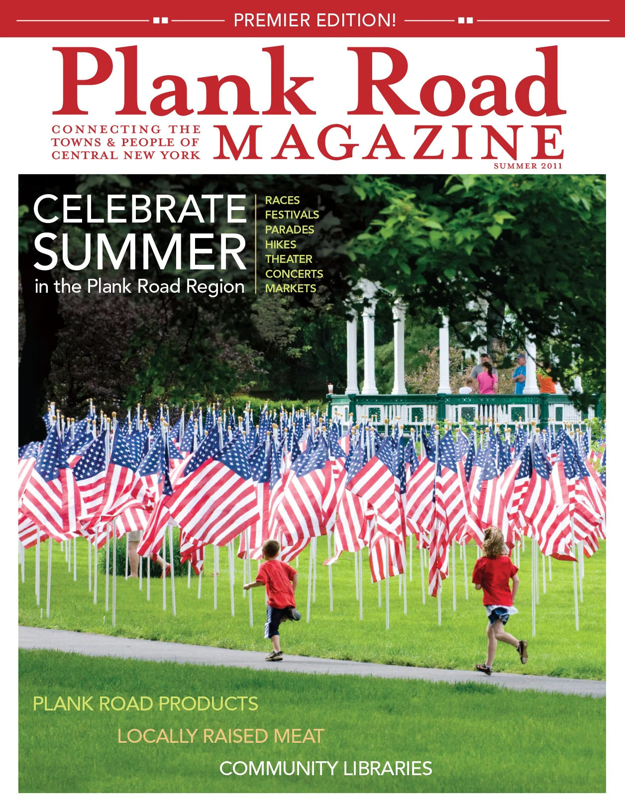
COVERS
Because Plank Road Magazine was conceived as a celebration of a particular group of Central New York communities, I designed each issue's cover with imagery sourced from the submissions of local artists (both amateur and professional). I framed each image in an unusual, saturated color and used large, bold type to help each issue stand out on any rack containing a number of other regional magazines.


