Climb Credit
Client: Climb Credit — My Role: UX Design Consultant — Project Duration: 3 Weeks — Platform: Responsive website
Tools: Sketch, Invision, Optimal Sort, OmniGraffle, Adobe CC, Google Forms
Project overview
Climb Credit was established in 2014 to provide educational loans for specialized, alternative, and trade programs. Stakeholders sought our expertise to increase use of their Refer-A-Friend program. Our research into this perceived need revealed a larger, overarching concern: less than satisfactory user experience effects borrower experience and decreases the likelihood of making a referral.
research
INITIAL PROBLEM STATEMENT
How might we increase use of the Refer-A-Friend program?
research sources
Usability test of existing referral program Students enrolled in specialized educational programs
Stakeholder interviews Product, Engineering, Operations (aka Client Success), Marketing
User Interviews Climb clients, (general) student loan borrowers
User Net Promoter Score Survey Aggregated customer feedback
insights
(1) Climb’s referral program can only be effective if:
current borrower knows someone who is also seeking alternate educational funding
current borrower has a positive experience with Climb
current borrower feels the incentive is worthwhile
current borrower has awareness of the program
(2) User experience along the life of the loan is problematic because:
user portal information is not structured intuitively
some highly desired information not available on portal
loans are paid through a third party (UAS) but users experienced confusion and distrust because there was little communication that this would be happening: many users thought their loan had been sold to a different bank.
Persona

revised Problem statement
The likelihood of referring Climb to friends is directly related to their overall loan borrowing experience. Currently, communication between Climb and the borrower is sparse upon signing the contract and retrieval of specific and necessary information is not intuitive for the borrower on the dashboard.
How might we redesign the borrower portal so that the borrower has a better experience with Climb and is more likely to refer a friend?
Research to design
Pain point: Important information isn’t structured intuitively
→ Restructure/redesign information within portal
Pain point: Refer a Friend program isn’t easily found
→ Place the RAF button above the fold on portal
Pain point: Borrower isn’t aware of the third party handling payments (UAS)
→ Include mandatory overlay message with information about UAS
Pain point: Climb isn't proactive with promotion of referral program
→ Include a standalone email to market the referral program
reDesign
Addressing problems with the borrower portal
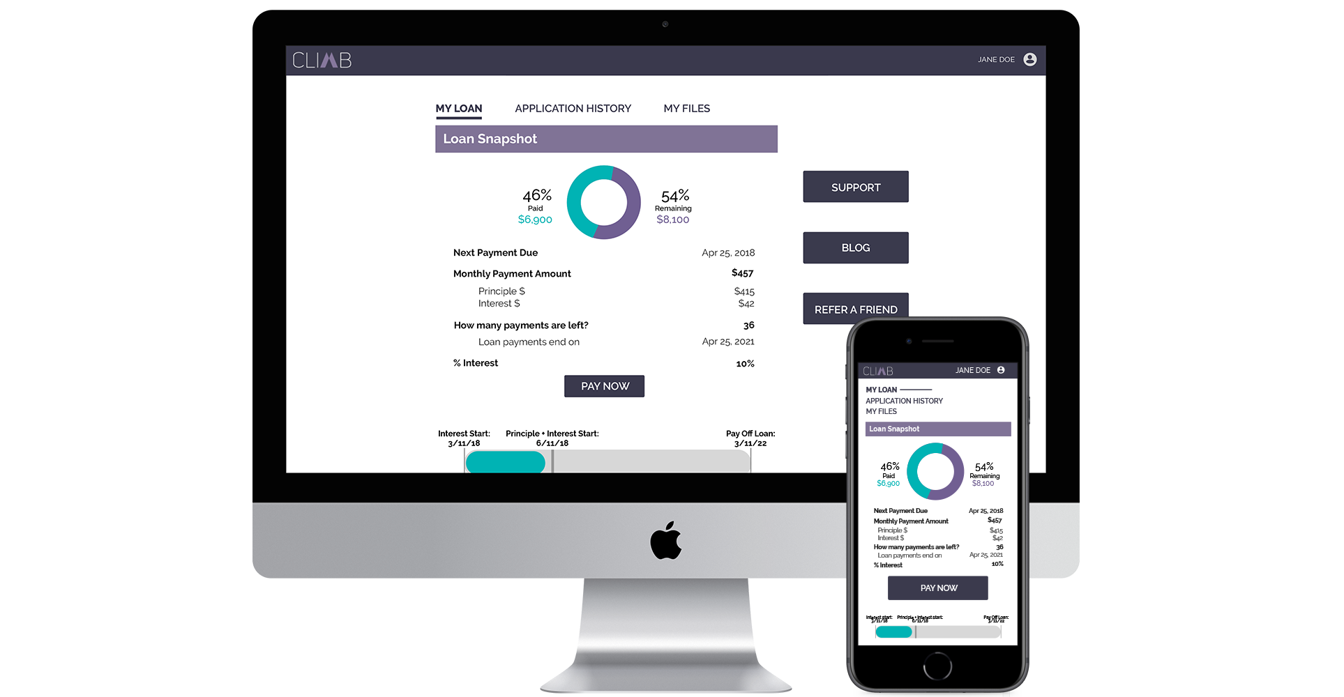
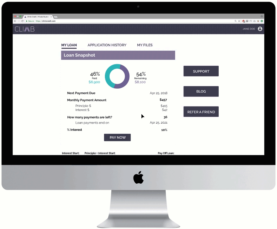
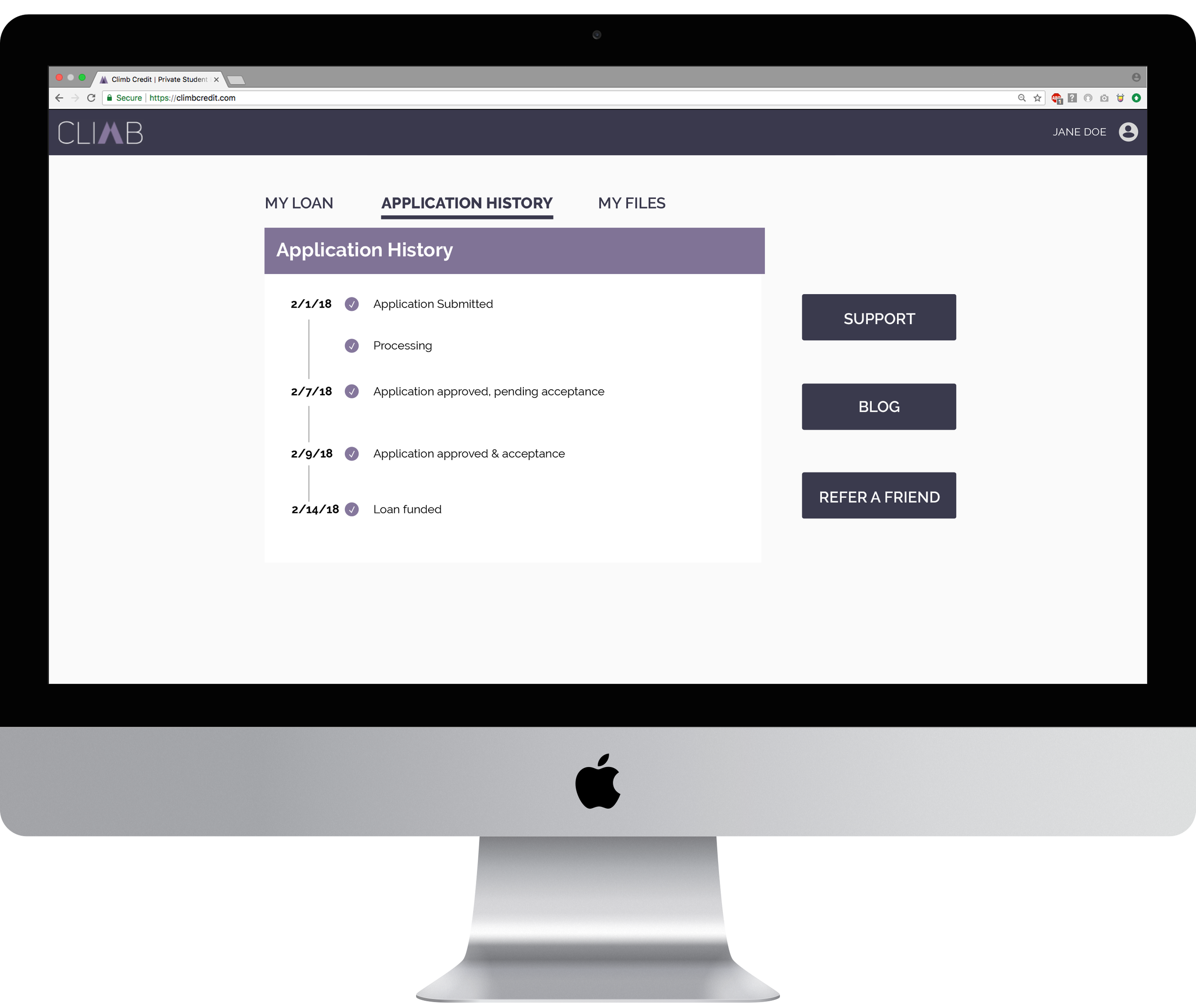
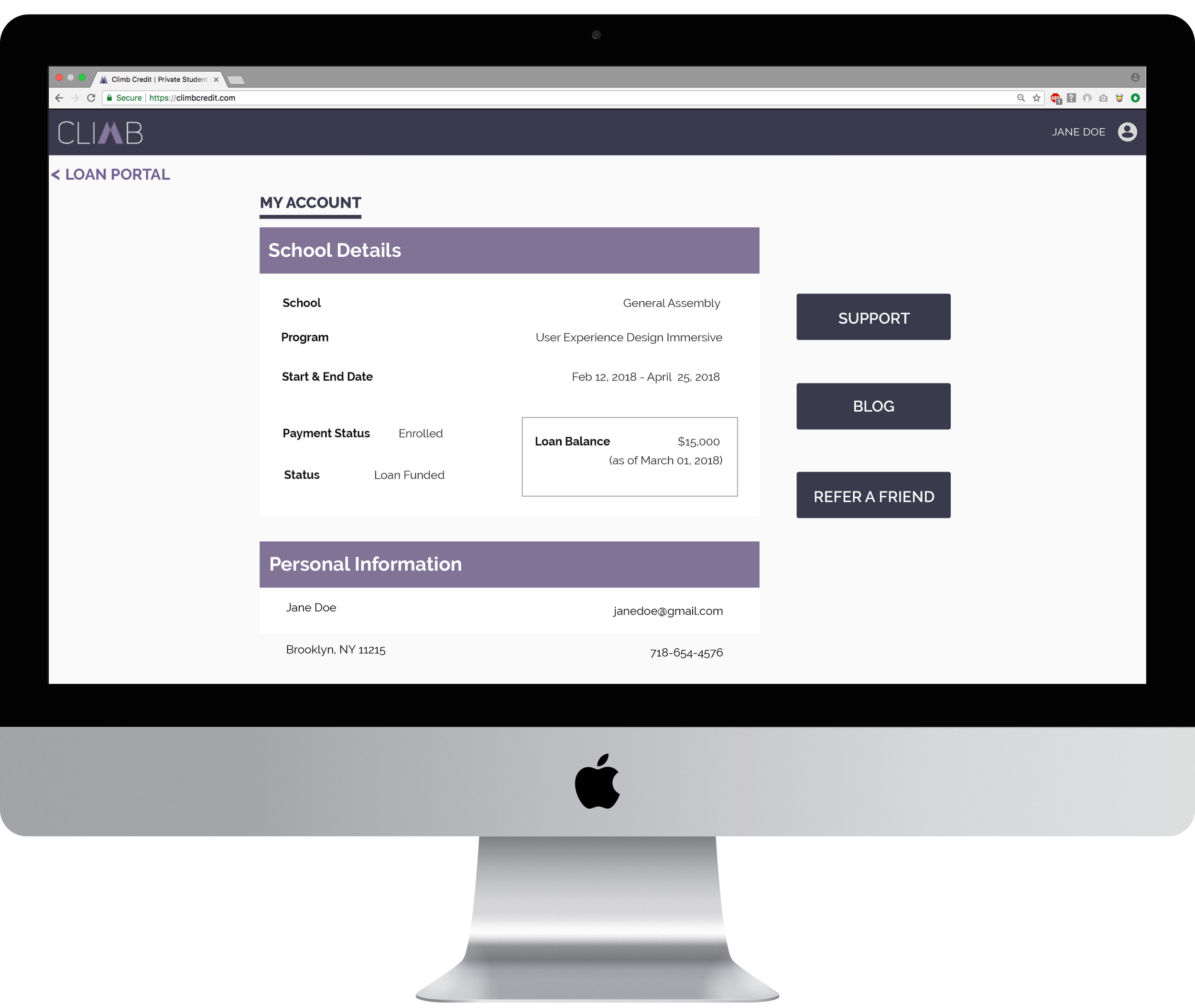
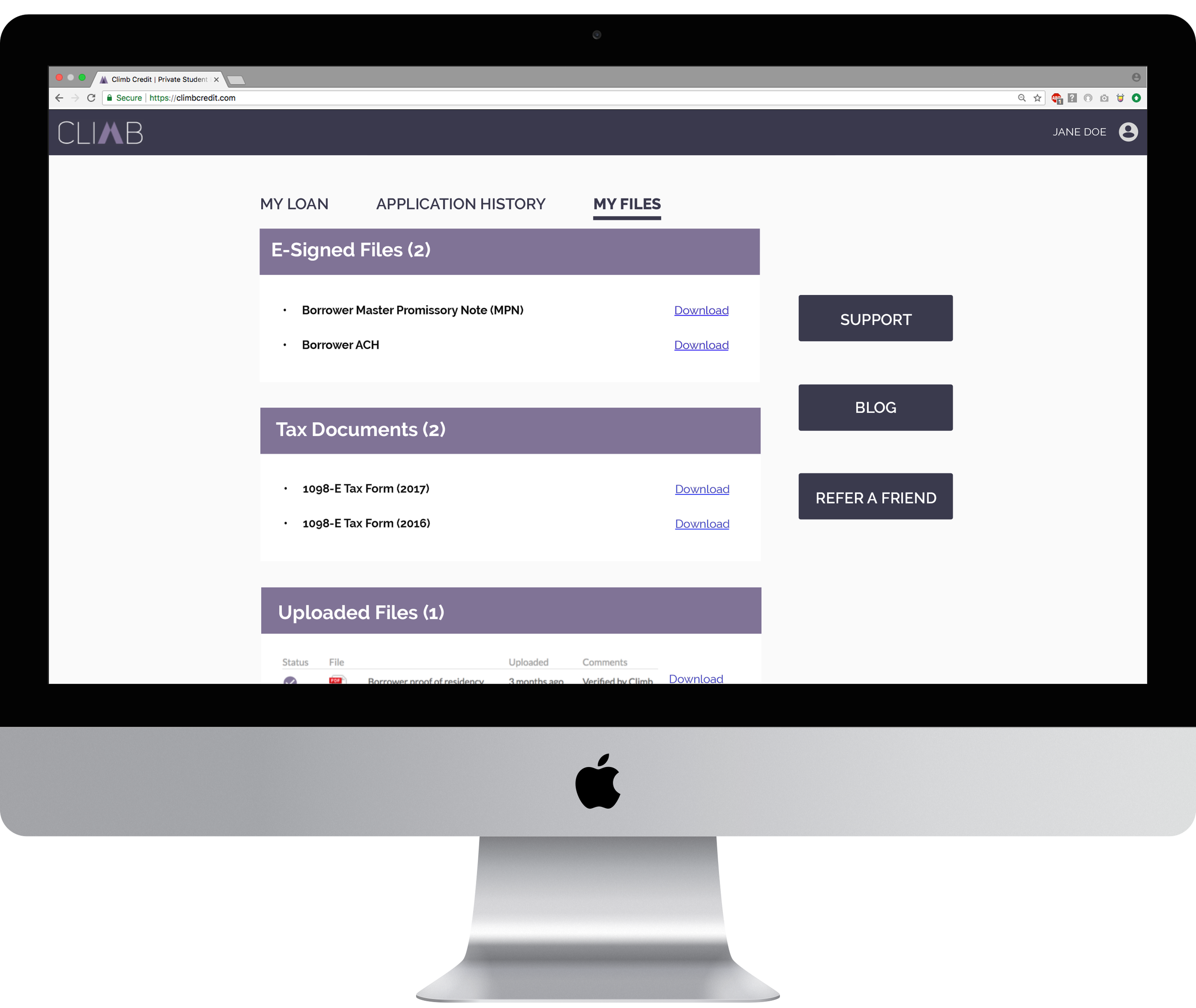
Recognizing that the existing borrower portal’s lacked both logical organization and detailed content, we conducted an open card sort to determine more intuitive groupings. Our revised portal design breaks information into the following tabs:
My Loan, with detailed financial information and helpful infographics to track payoff balances
Application History, to track applications for loans during the approval process
My Files, where statements, tax documents, copies of emails and uploaded documents are stored
We placed a static navigation bar to the right of the main portal, giving quick, easy, and most importantly obvious access to borrower support and contact information, a helpful blog about finances and educational goals, and the referral button that had been lost in the previous design.
Revising the referral pop-up for clarity
The existing, with a large amount of text and confusing options
Our solution, a quick summary with fun icons and a single option to send the referral link via personal email
De-mystifying the University Accounting Service (UAS) handoff
Clients usually misinterpret payments being made through Climb's third party accountant as a new bank’s involvement and this fosters suspicion and distrust between the borrower and Climb.
Upon clicking on the “pay now” button in the portal’s first and most important screen, borrowers are first introduced to details about UAS before taken to its site to complete payment.
Existing site's explanation of UAS handoff is heavy on text; users generally click straight through and ignore the explanation.
Our solution is to edit the copy to a digestible amount. Addition of the exclamation icon is designed to capture attention.
Prototype
next steps
We proposed that a stand-alone reminder of the program could be deployed if Climb surveys revealed a borrower had become employed.
We also proposed, according to a suggested dollar-amount cap from Climb stakeholders, that the incentive itself could change over the course of the user journey.
Stars indicate where we suggested changes to the incentive (dollar amounts based on stakeholder budget suggestions), and one additional email to remind borrowers of the referral program.
Additionally, we believe the following additional steps would be beneficial:
Test an incentive for the referred friend
Test redesign of Refer a Friend CTA on website
Establish partnership deals for additional incentives
Figure out the feasibility of incorporating credentials for UAS within Climb’s site to further simplify the paying process